One week with Pebble Time
Given my nonplussed attitude towards the product, I was surprised when I found myself throwing money at the new Pebble Time Kickstarter. The videos of the new watch grabbed me in a way that the original product had failed to – colour, animations, design, apps – this iteration seemed to correct everything that the original lacked. So, I waited patiently for the watch to arrive (they definitely improved their logistics since their first attempt), and have now had a week to play. So I repeat the question I answered last time – have I fallen in love with this watch?
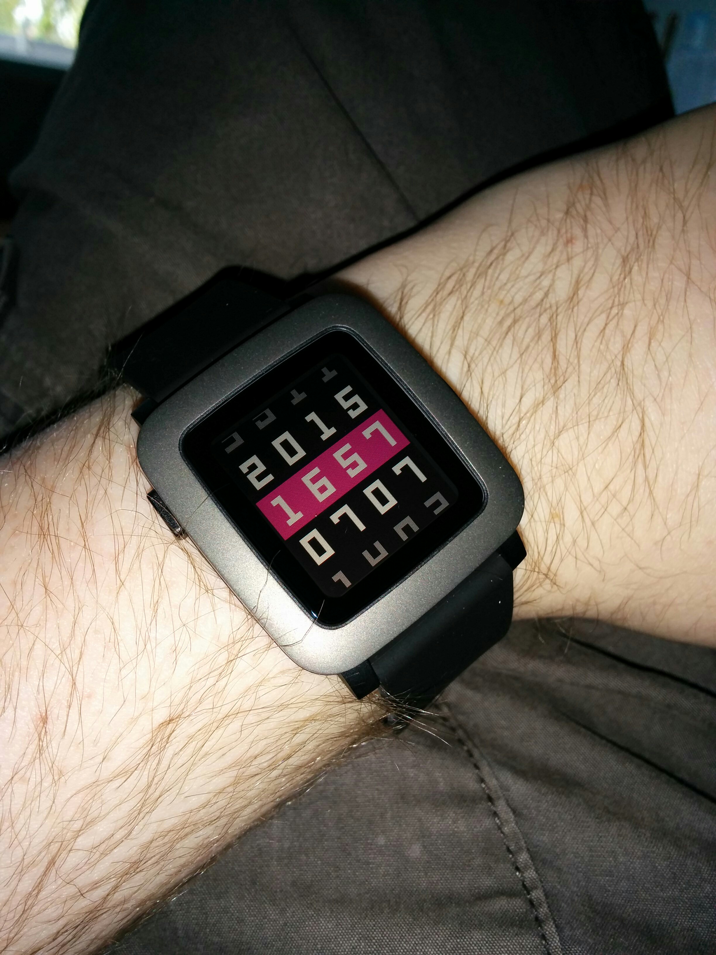
The answer – slightly more than last time! The watch is definitely a much better designed product, it looks and feels a lot better on my wrist, as the original was starting to look very dated in this Apple Watch/Android Wear golden era of wearable technology. The menus flow an awful lot better with some slick animation, and even though I find the screen a little harder to read, the colours really do improve the display. It feels like much more of a product, rather than a proof-of-concept piece of hardware with some poorly thought out software thrown on top. Integration with my phone is much more seamless as well, the new Pebble Time app has replaced the need to have separate applications installed for receiving third-party notifications, and the watchface/app store seems better integrated.
So what’s putting me off? To me, it still seems like a convenient device to view notifications on, and not a lot more. It’s missing a few “killer apps” like the Android Wear integration with Maps, or gestures on the Apple Watch. While the Pebble Time may be a much more desirable piece of hardware, and streets ahead of the original edition, I feel the software has fallen short of the mark yet again.
That said, I won’t be rushing out to buy the Apple or Android equivalent – the price points, battery life and physically large size of the alternatives have put me off for the time being, so the Pebble Time does have a place on my wrist for the foreseeable future.